Designing a Predictive Risk Model for High-Value Assets
Overview
This project demonstrates an end‑to‑end approach to designing, validating, and evaluating a predictive risk model in a pricing context. The focus is on modelling judgement, feature design, and validation rather than maximising headline performance metrics. Here I’ve intentionally generated a challenging synthetic dataset to demonstrate the modelling options available in typical insurance pricing contexts.
Disclaimer to CMA: All data used in this project is fully synthetic (generated right before your very eyes, no less) and does not reflect any proprietary datasets.
Problem Statement
We consider a hypothetical insurance‑style problem where the goal is to predict the probability of a high‑cost loss event for individual policies, based on customer, asset, and contextual features.
Key challenges include:
Class imbalance
Feature leakage
Model interpretability vs performance trade‑offs
Data Generation
We generate a synthetic dataset designed to capture common characteristics of real‑world consumer risk portfolios:
We’ll keep feature engineering very basic here, banding features for interpretability and stability, with transformations / interactions chosen to reflect common approaches used in pricing and risk models, rather than going for model complexity straight away.
import numpy as npimport pandas as pddf = data.copy()# Log-transform heavy-tailed monetary valuesdf["log_vehicle_value"] = np.log(df["vehicle_value"])# Mileage exposure bandsdf["mileage_band"] = pd.cut( df["annual_mileage"], bins=[0, 5000, 10000, 15000, 25000, np.inf], labels=False)# Age bands to capture non-linear risk patternsdf["age_band"] = pd.cut( df["driver_age"], bins=[17, 25, 35, 50, 65, 100], labels=False)# Interaction: high value asset in dense urban areasdf["urban_value_interaction"] = ( df["urban_density"] * df["log_vehicle_value"])engineered_features = ["log_vehicle_value","mileage_band","age_band","urban_density","prior_claims","urban_value_interaction"]X = df[engineered_features]y = df["high_cost_claim"]X.head()
log_vehicle_value
mileage_band
age_band
urban_density
prior_claims
urban_value_interaction
0
9.457185
0
4
0.171791
0
1.624659
1
10.498673
3
1
0.065992
0
0.692828
2
10.141489
1
3
0.222687
1
2.258378
3
9.246853
2
4
0.683120
0
6.316712
4
9.710700
0
4
0.366287
0
3.556906
Modelling Approach
As a baseline, let’s fit a logistic regression model using the engineered features. Logistic regression provides a transparent and well‑understood benchmark, allowing coefficient‑level interpretation and serving as a reference point for more complex models later on.
from sklearn.model_selection import train_test_splitfrom sklearn.preprocessing import StandardScalerfrom sklearn.linear_model import LogisticRegressionfrom sklearn.metrics import roc_auc_score# Train / test splitX_train, X_test, y_train, y_test = train_test_split( X, y, test_size=0.3, random_state=42, stratify=y)# Standardise features for logistic regressionscaler = StandardScaler()X_train_scaled = scaler.fit_transform(X_train)X_test_scaled = scaler.transform(X_test)# Fit modellog_reg = LogisticRegression(max_iter=1000)log_reg.fit(X_train_scaled, y_train)# Predict probabilitiesy_pred_proba = log_reg.predict_proba(X_test_scaled)[:, 1]roc_auc = roc_auc_score(y_test, y_pred_proba)roc_auc
0.6906500333778371
To contextualise this value, it’s worth bearing in mind that random guessing would achieve an ROC AUC of 0.50, 0.70+ would indicate strong separation, and 1.0 a perfect model.
Our value shows that the model could be stronger, but is still better than random. In a real insurance context we would have at least a few different options to explore here to improve the model:
… but we don’t want to end up turning this scenario into a toy problem; this isn’t Kaggle.
Let’s keep the focus on evaluation and calibration, as we’re not interested in maximising performance just yet, we’ll save that fun for later when we see what gradient boosting can do.
Coefficient Interpretation
Inspecting model coefficients quickly helps us validate whether learned relationships align with domain expectations.
Obviously since we created the label ourselves using a logit distribution we’re not surprised to see the original coefficient values reflected here in the logistic regression model. In reality at this stage of modelling we wouldn’t be expecting to deduce anything profound yet from an unsophisticated view such as this, but we might opt to construct a rough-and-ready feedback loop with our feature engineering choices for rapid prototyping.
In my experience this type of feedback loop can pay dividends for improving the efficacy of engineered features without too much additional time or resource, and works especially well when the chosen evaluation metrics are thoughtfully chosen, such as measures of marginal predictive skill contribution / model uplift on a feature level basis.
Validation and Calibration
In risk‑based decision systems, well‑calibrated probabilities are often as important as ranking performance. We therefore examine calibration behaviour alongside discrimination metrics.
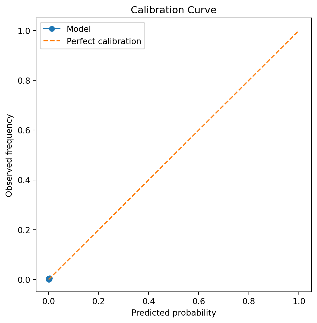
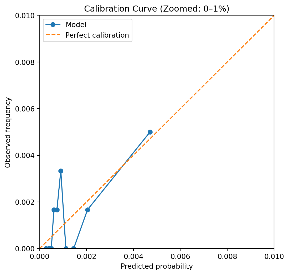
Not much to see here, it seems… We’ve chosen a difficult problem to model, that of a rare-event setting, such as a large 3rd party BI claim in UK motor insurance. Let’s see how far we’d need to zoom in to see what’s going on.
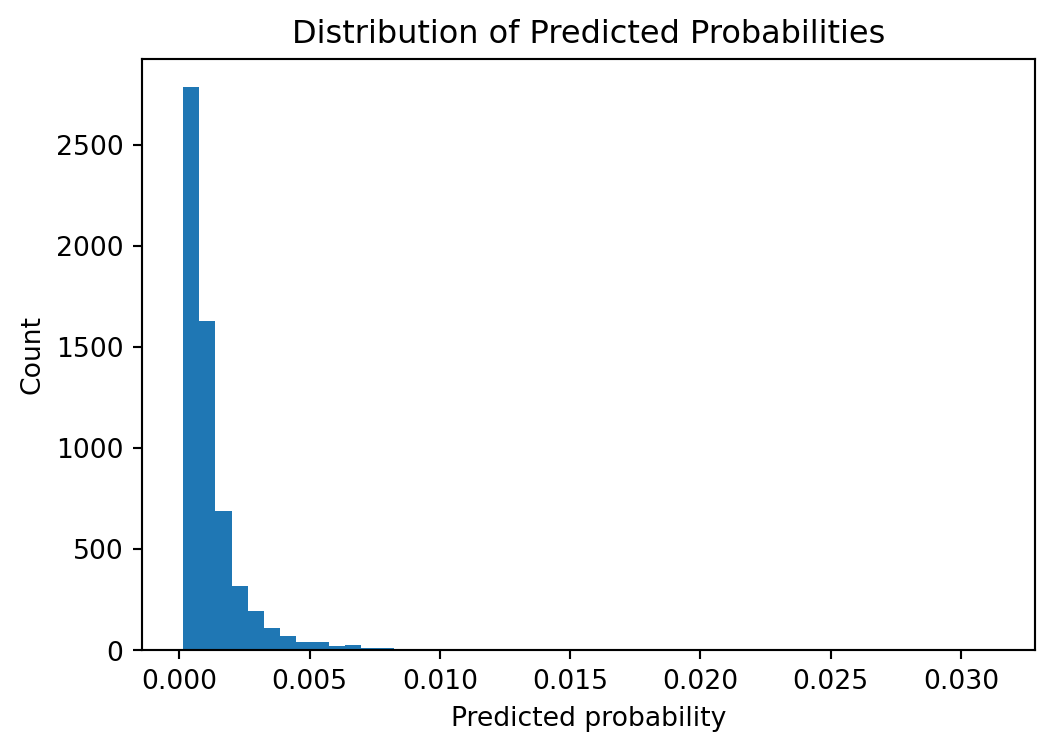
Histogram of probabilities
plt.figure(figsize=(6, 4))plt.hist(y_pred_proba, bins=50)plt.xlabel("Predicted probability")plt.ylabel("Count")plt.title("Distribution of Predicted Probabilities")plt.show()
So looks like probabilities are only significantly allocated between 0% and 1%
The calibration curve assesses whether predicted probabilities correspond to observed event frequencies. Predictions that lie close to the diagonal indicate well‑calibrated probabilities, while systematic deviations highlight over‑ or under‑confidence.
In rare‑event settings, calibration at higher predicted probabilities can be noisy due to limited sample sizes. Nevertheless, this analysis provides important insight into whether predicted risks are suitable for downstream decision‑making or require post‑hoc calibration.
Here we can see that the model seems passable at assigning probabilities that aren’t too far off of the mark, generally speaking. If we had grouped more aggressively we might not see as much noise, but I tend to prefer erring on the side of seeing the noise and reassuring myself that it truly is noise, and not a systematic calibration error that may need further thought. Here the points seem fairly randomly distributed around the perfect calibration line, so no strong need for post-hoc calibration necessarily yet, but there’s more we can do to answer this concern.
Brier Score
The Brier score is defined as $ (p_i - y_i)^2 $ averaged over observations. In other words the average squared error in the predicted probabilities.
The Brier score is a proper scoring rule that measures the accuracy of probabilistic predictions. For a binary outcome, it is defined as:
where \(p_i\) is the predicted probability of the event and \(y_i\) is the observed outcome.
from sklearn.metrics import brier_score_lossbrier = brier_score_loss(y_test, y_pred_proba)brier
0.0013324230061909923
Lower Brier scores indicate better overall probability accuracy, penalising both over‑confident and under‑confident predictions. Unlike ROC‑AUC, the Brier score directly reflects the quality of predicted probabilities, making it particularly relevant in risk‑based decision systems.
Although this value looks fairly low in absolute terms, let’s bear in mind that we’ll need to check against a logical benchmark to know how good a score this is, and whether we should be reassured or alarmed at its value.
Brier Skill Score
Interpreting the Brier Score is easier with a relative measure like the Brier Skill Score (BSS), which measures the improvement in probabilistic accuracy relative to a reference forecast. It is defined as:
In this example, the reference forecast is a constant base‑rate model that predicts the empirical event rate for all observations. For rare event scenarios such as the synthetically generated dataset we’re looking at, this is somewhat difficult to beat, so let’s see how we did:
A positive Brier Skill Score indicates that the model improves probabilistic accuracy relative to the base‑rate benchmark. Negative means we’re predicting worse than the default base-rate prediction. The Brier Skill Score contextualises absolute probability error by comparing against a naive baseline. In rare‑event problems, even modest positive skill represents meaningful improvement over base‑rate forecasting.
However, it’s important to note that a negative Brier Skill Score does not necessarily mean the model is performing badly. Just that it is not yet calibrated properly. Earlier we saw an okay ROC AUC value, so let’s consider post-hoc calibration options to see whether we can optimise our probabilities without deteriorating the ranking performance that we were otherwise happy with.
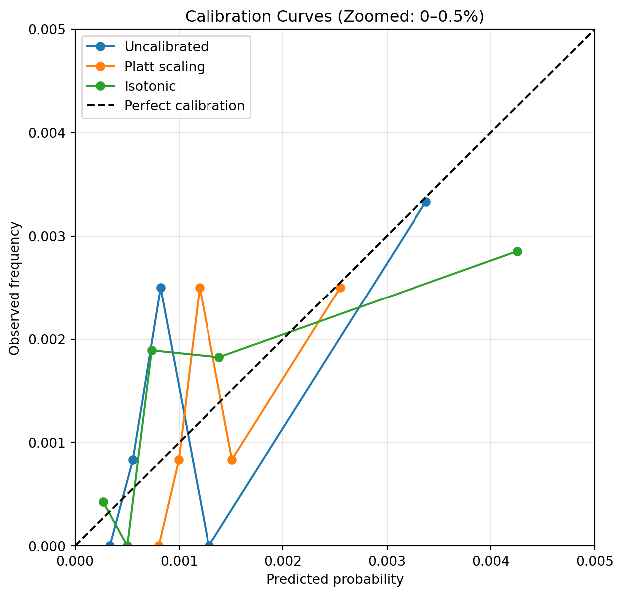
Post‑Hoc Calibration Comparison
To assess whether probability calibration improves probabilistic accuracy, we compare the uncalibrated model against two post‑hoc calibration approaches: Platt scaling and isotonic regression.
Post‑hoc calibration improves probability scaling relative to the uncalibrated model, reducing overall Brier score. We can see here that both Platt scaling and Isotonic calibration improved our Brier Skill score into a slight positive result, from negative originally. This confirms our suspicion that our model probabilities were suffering from a calibration issue. Let’s redraw our calibration curve and see the difference.
Calibration Curves: Before and After Calibration
To visualise the effect of post‑hoc calibration, we compare calibration curves for the uncalibrated model and the calibrated variants. Given the rarity of the event, the plot focuses on the probability range where most predictions lie.
Post‑hoc calibration improves the alignment between predicted probabilities and observed event frequencies. Platt scaling provides a smooth adjustment that improves probability reliability, while isotonic calibration offers greater flexibility at the cost of increased variance in sparse regions. In rare‑event settings, these trade‑offs must be balanced thoughtfully.